Note: Until I populate this article with more examples to see the three principles in action, take a look through your own product photos and some posts from your favorite creators.
More than five years have passed since I started creating with purpose and I began photographing my work.
There were many lessons to learn in the beginning about product photography, and I wrote them down quickly, so I wouldn’t forget them.
With time, after being exposed to so many wonderful product photos (and oh so many not nearly as wonderful as they could have been), an intrinsic knowledge has been building inside my mind.
Now is the time to share it with you, so you can improve your photography and attract exactly the audience you want (also, customers! $$).
For these principles, the camera you use is not quite as important as how you use it.
Sure, hiring someone with fancy equipment and a lot of experience is one way to go, but when you’re just starting out you don’t really have the budget to hire a professional.
Your photos will definitely improve with time (money, courses and better equipment as well), but you can apply these principles from the first photo you take of your products and you well get higher engagement anywhere you publish your photos online (you can’t really measure engagement in print media).
These are the three highly important and yet easy to remember principles
White diffuse light (preferably natural)
The colors you choose send powerful messages, both about you, as a maker, and about your customers.
One of the reasons your customers choose your products is your compatibility with their principles, lifestyle and the way they see the world.
Colors are also important cultural symbols, they individualize and connect.
So you want to show in your photography exactly what your products look like when seen directly by a person.
Our brains have an extraordinary capacity to extract color information in almost any kind of artificial light, but our cameras don’t have brains and they are stuck with whatever firmware and software they have.
Yes, you can tweak the colors in post-processing, but you will never get a real color representation if you don’t use white light.
It’s important to always tweak the white balance if your camera allows you to, so as to get the colors closest to reality, but most cameras will do an excellent job when working with natural white light.
Even though your brain is capable to compensate individually for all the areas in your vision, so you can see well even in bright sunlight, your camera does not have that kind of powers.
You don’t want to take pictures in direct sunlight both because of the strong contrast and loss of shade details and because the camera is under a lot of stress when trying to capture both really bright and really dark spots.
The sensor is overwhelmed and setting a manual exposure will just result in either overexposed pictures with white patches (burns) or underexposed pictures with black areas that no post-processing can possibly save.
There are some exceptions to this, such as taking pictures of outdoor furniture in a specific setting at sunset or sunrise. The light is less intense and it gives a reddish glow to everything, which is useful when you want to evoke nostalgia for pleasant evenings spent with the family or friends.
Except a few cases, the best setup for product photography is outside or in front of a window on a cloudy day (not quite overcast or just before a storm). The clouds diffuse the light and you will have soft shadows and a lot of detail, both in terms of shading and depth of color.
If your products can be worn or integrated into an outdoor setting or studio, go for it. It’s extra awesome when you have a person to model your items, especially if they are intended to be worn.
If your photography schedule is not flexible enough to let you wait for cloudy days, consider studio lighting.
You need two (or more) lamps and white fluorescent light bulbs (with a temperature of 5000-6500 K).
Try to find the ones with the highest intensity (expressed in lumens), since most light bulbs for interior lighting have a lower intensity than what is necessary for photography.
You may have to get them at a specialized photography store, but that’s an investment that will save you a lot of time and energy.
Another useful item is a light tent or a table for photography, which you can make yourself or buy ready-made. The point is to diffuse the light from the light bulbs, which can be quite direct.
The lamps that I bought came with a large reflective bowl and a white fabric cover, exactly for this purpose. They also each had a tripod, of which one is already broken, after being used for a few times. Please check what you buy because if it sounds too good to be true, it might actually be.
Concept or atmosphere
Anything you create has a purpose and will be used in a diverse environment, together with different objects, to create an experience for someone. It will never be isolated, so why should you photograph it in an isolated setting?
Yes, taking pictures in a clean setting is important, but the only reason why classic product photography isolates the products is because it can integrate them later into another medium.
Open any magazine or well-known website catalog and you will notice a lot of photo editing, a lot of products cut and pasted into a new environment, just to create an illusion of a perfect world.
Photographing objects in a sterile environment (be it white or not) also helps focus on the craftsmanship, the quality of the materials used, the elegance of the piece itself. What it does not do is create a connection between you as a creator and the person who will ultimately own and use the product that you worked so hard to create.
You may not have the budget, or time and skills to take such pictures and edit them into collages that look like they belong in a magazine, but you don’t have to. Actually, you shouldn’t.
Honest marketing is much more valuable because it lets the customer know that what they are buying is exactly what they see, not a lie aided by touch-up software. Then they trust you more and go back to you because they know that what you sell is real.
You can create and photograph real settings where your products can and should be used, worn, enjoyed.
You can create an atmosphere that will connect your potential customers to you through their values and views on life itself, not just the need of a product.
Chances are, since you are a creative person that spends time on designing and creating products, your creations are on the high end of the price spectrum (if they’re not, they should be, but that’s another discussion).
Through your photography, you connect and explain how and why your ideal customers want to have and use your products instead of something that’s mass produced.
Every time you see a product photo that makes you think “I want that so badly”, stop and study it. What is it about that picture that makes you want anything that’s in it? Is it the product itself that you want or are the feeling associated with how the item is portrayed the ones that made you think like that? Surely you could find dozens of other similar products out there, so why this one?
I’m not talking now about art or high-end-one-of-a-kind-nobody-can-afford stuff or about food (really tasty and nutritious food can look horrible and smell heavenly, while beautifully styled food can make you drool, but only as long as you don’t try to smell or taste it). I mean everyday objects like furniture, clothing, tools, supplies and other things that we need in our lives.
Creating an atmosphere around a product is not entirely styling. Styling would be altering or posing the object in such a way that any imperfections are hidden and the object is portrayed in its most attractive angle (just like with humans). You want to style a bit, but you also want to create an environment in which the product is naturally found,
It’s important that the product you want to photograph is the main attraction of the picture, so make sure you eliminate any details that might distract a viewer’s attention.
Make sure to create a contrast between the patterns in the background and the product (if the product has a color pattern, use something neutral as a background, maybe with a bit of texture). Y
ou want balance, so anything that seems out of place probably is.
When in doubt, eliminate that element and see what happens.
Perspective
What’s more appealing to you, a close-up of a product that you can almost touch, or a distant picture of an item that’s to distorted by the lens of the camera that you can’t really tell what it looks like in reality?
An encounter with a product that gives you the impression that you are holding it in front of your eyes or a mere representation of an object from a distance?
I think you have already noticed that the most interesting product photos put the product in the spotlight and bring you close to it, as if you were sitting exactly next to it.
Every time you photograph an object, try to show it as if you were holding it in your hands, before your eyes, vertically, to show details that are not visible to someone looking at the object from a distance.
This kind of perspective not only allows you to show more details, but it also creates intimacy and familiarity with the product.
When you see a good product photo, you feel like the product is inviting you into its personal space, it’s inviting you to touch it, to caress it and feel the different textures, to roll it around, to pick it up and experience it as a whole object which brings you joy.
Creating this tactile sensation is maybe the most important feature of a good product photo, along with pure visual pleasure.
If you don’t want to touch an object, to feel it in your hand, to clothe yourself in it, to wear it, to make something with it, anything, you will not want to buy it.
There will be no reason for you to.
So next time that you take photos of your products, try to visualize them from this perspective, one that will make anyone see the picture want to get up close and personal with your products. Make it as real and close to the viewer as possible.
This brings me to another aspect in product photography, also concerning perspective.
Framing the product is essential for creating that familiarity.
You definitely want the product to occupy at least around 50% of the available frame when you use this perspective.
Not necessarily in the middle of the frame, though.
Yes, there are some really good examples with products placed in the middle of the frame, especially when the frame is square, but those are made by professionals with years, if not decades, of experience in photography.
Try to follow the rule of thirds in most of your photos and you will have made a lot of progress.
This means that when you use the up-close-and-personal perspective, you highlight some key details of the products near the points of intersection of the parallel lines that divide the frame in three, vertically and horizontally.
You can crop the photo later to achieve this, but I have noticed that you get the best results when you do this while taking the photograph.
You will have less post-processing to do and more time for creating.
What is really important is that at least a feature of the product is in the foreground and that you focus on it.
You can use manual focus or automatic focus. Cameras nowadays have options for picking areas in the frame to focus on.
Use that option on your camera if you don’t have manual focus. Don’t let the camera decide for you what’s more important in each frame.
What’s not so important is for the whole product to be in the frame. Why should it?
You can take several shots of parts of your product, as long as there is at least one that shows the entire product.
Remember to use those details to fill about half of the frame.
Here are two photos from a photo shoot for a poster promoting my butterfly workshops.
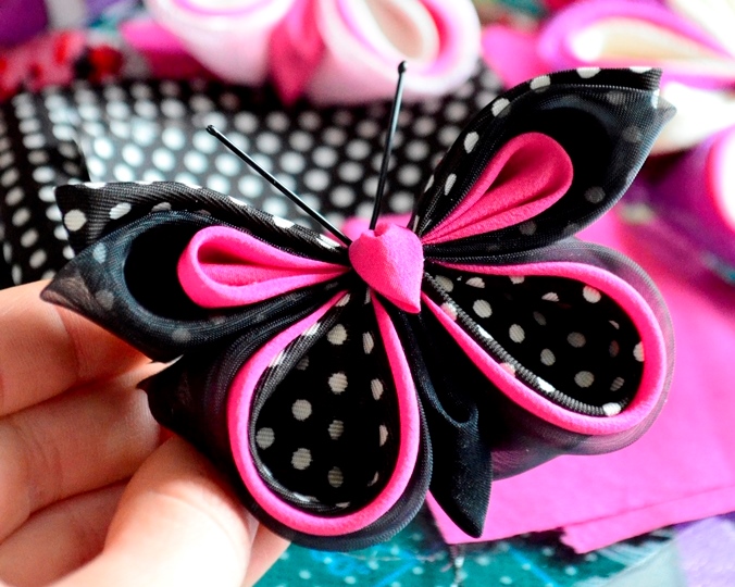
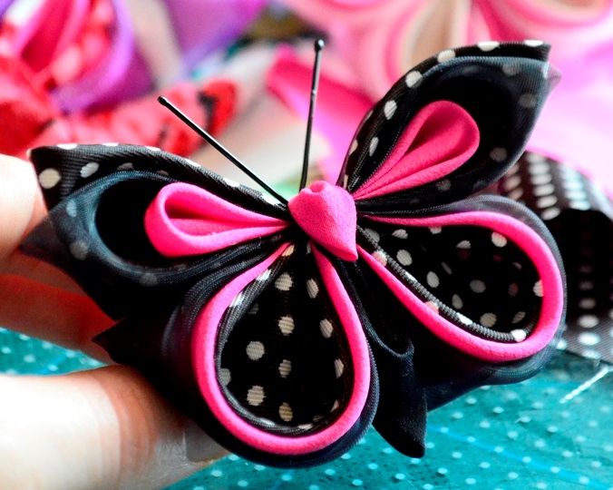
Can you apply everything that I’ve been telling you in this article and tell me what’s wrong with them, what’s right and what I should have changed?
For comparison, here’s the photo I chose from this series to make the poster (I don’t have the poster because someone else made it and it was a long time ago).
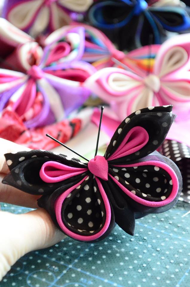
As an aside, here’s a shot of the same butterfly in a “commercial” pose. It’s the center of attention, suspended in mid-air, there are no unnecessary shadows or details to distract from the object itself.
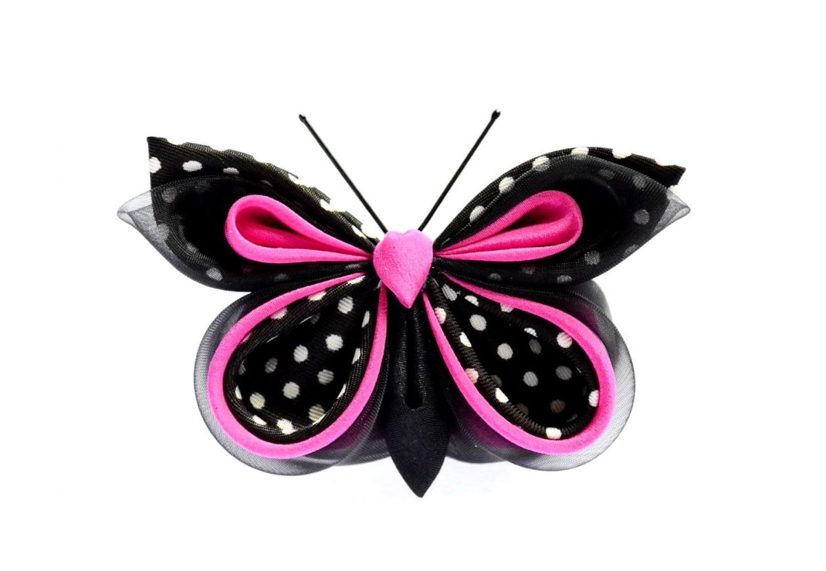
This is mostly what I wanted to tell you regarding product photography.
You may already know most of it, you may have known it in your guts and needed someone to put it in writing, you may have just discovered this and your product photography will be so much better from now on.
No matter where you are on your journey, I hope this article has helped you get a little bit further along.
As I’m always learning, please let me know if you have any remarks, additions, scientific research to back up or to contradict my claims or any questions that I may be able to answer.
Thank you so much for reading this and I’m looking forward to seeing you around here.
Lots of love,
Andrea

